2022
The opportunity
When starting new projects for companies many either do not have a Design System in place or it is incomplete. By creating a Design System template we can accelerate the process of delivering concepts and also define best practice guidelines when creating the styles and components, so designers can learn how they should build their own.
Challenge
To create a robust but flexible design system that can adapt to different projects, and with a few minor changes can be quickly used by the team involved in the project.
The team
Multiple people were involved in this initiative; 5 designers, collaborated in different stages of the process. We also met with 2 front-end engineers, to align our ways of working, as they would be coding the components.
My objectives as Design Lead
As someone who had experience building design systems I took the responsibility to lead this project.
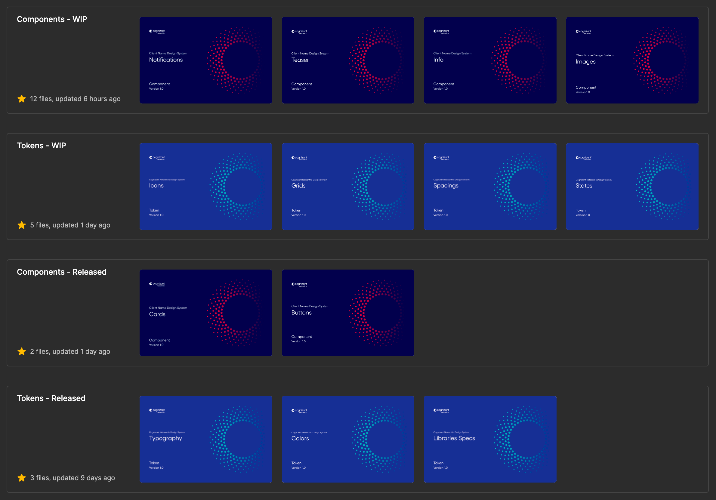
The files are divided into folders, having WIP and Released to show which ones are completed and ready to use
Roadmap
In order to have successful releases and align with the team, we started by:
- Defining styles and components to be included
- Adding to a Kanban as tasks
- Prioritizing those tasks
- Defining when a task is complete:
- Is available on different viewports (if necessary); mobile, tablet, and desktop.
- Has both light and dark theme
- Contrast accessibility has been tested
- Guidelines have been created
- Usage examples have been added
- Review with a peer has been done
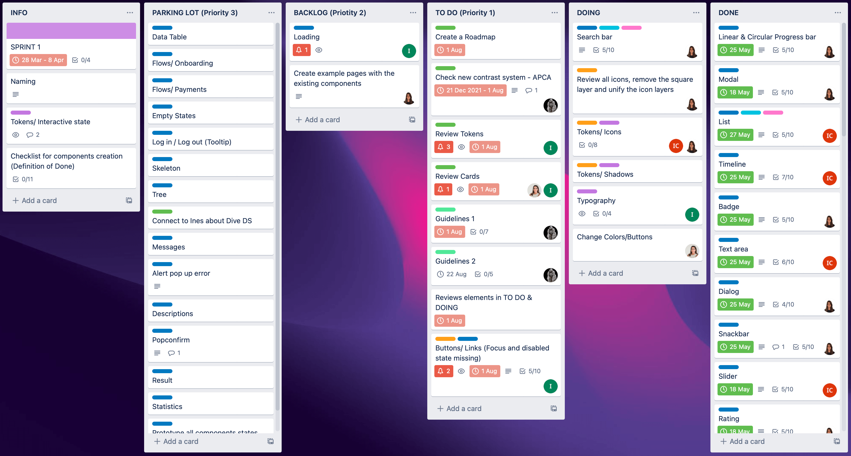
We used Trello to create a Kanban to help us bring clarity of priority, what to work on next and what needed to be reviewed
Tokens and components
Design tokens are the values needed to build a design system, like colour, typography, spacing, etc. That's why we created folders for the tokens, separated from the components, which are the reusable blocks of the design system.
We also took the atomic design methodology, that's why we started with the atoms, which are the basic building blocks.
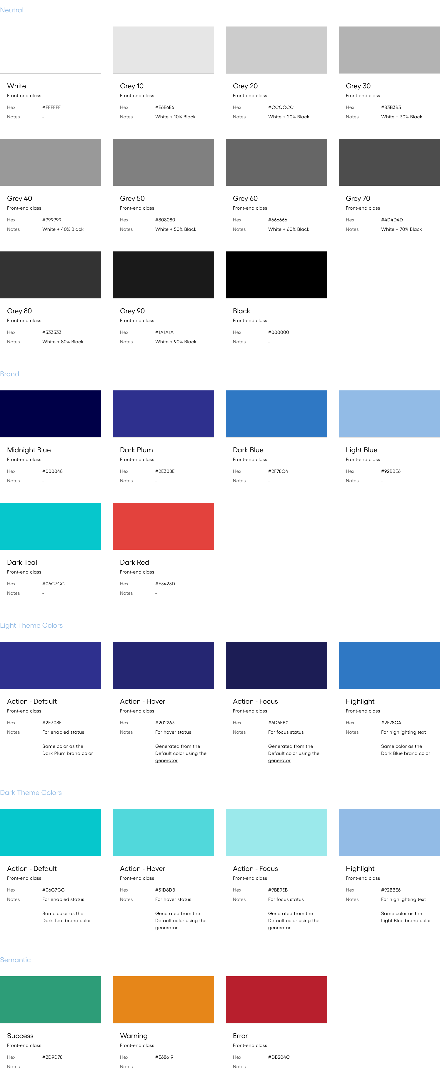
Colours
To create the colours, I defined a rule to be able to have the different states we needed for components like the buttons; to generate the hover and focus we use 20% black opacity increments for the light theme and 20% white opacity increments for the dark theme.
Then when the brand colours of a new client are used, we ensure that the states pass the contrast accessibility test.
The same way the grey colours were defined, by adding increments of 10% black opacity over white colour.
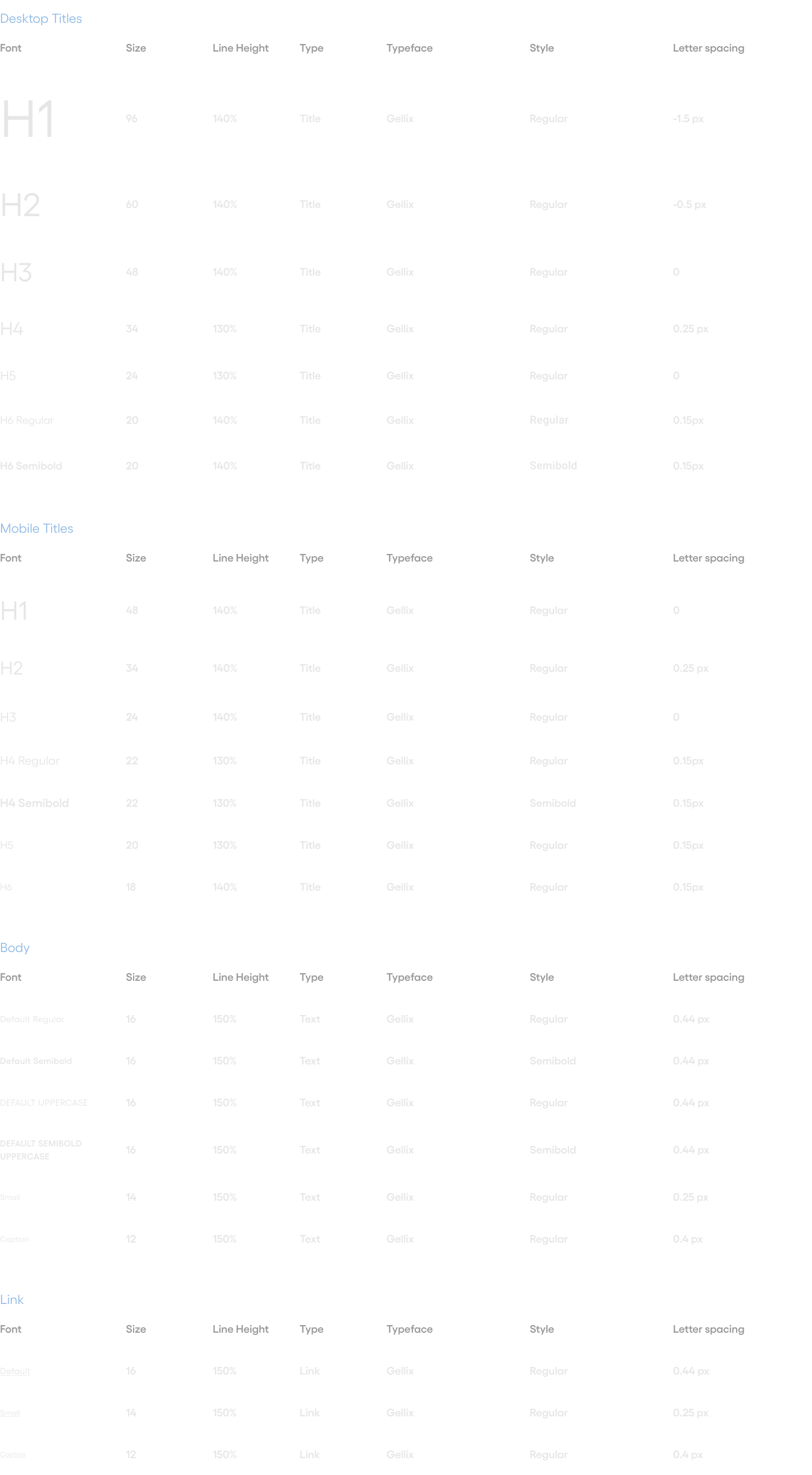
Fonts
We took Material Design type system as a starting point and then modified it, we started testing Netcentric Cognizant's typeface (Gellix) in different scenarios.
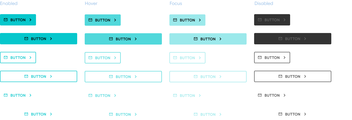
Buttons
The different states of the button are represented below. Three types of buttons are available; primary, secondary, and tertiary.
Also with the latest Figma update, we were able to reduce the number of variants, defining attributes like the icons on the left and the right as booleans, instead of having to create different variants for each case.
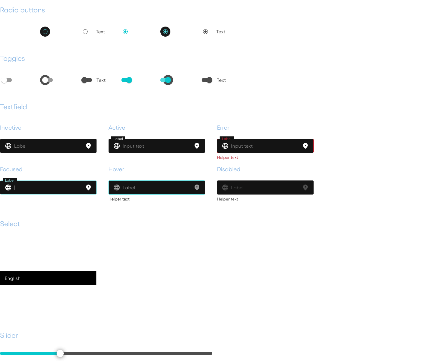
Forms
Cards
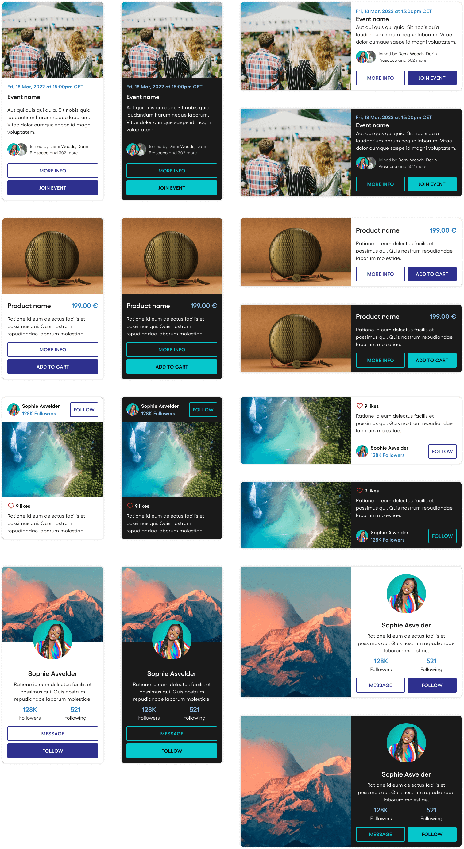
Four different types of cards were defined, that could fit different usage cases: event card, product card, social media post card, and profile card. The cards were built as light and dark themes, then vertical and horizontal to fit as many different use cases as possible.
Final thoughts
This initiative has proven to be very useful for our team, the feedback has been very positive and has become the starting point for any projects that needed a Design System.
Building the design system, the most crucial part was deciding how to proceed at each step, defining the processes, and reaching consensus.

Isaac Vigil © 2026