Kia Stock Locator
Opportunity
This project came off the back of my work on Kia's car configurator, a previous engagement that went so well Kia came back with a new challenge.
During that period, a global chip shortage was causing significant delays in car delivery timelines, pushing customers to wait months for their configured vehicle.
The idea emerged: what if customers could find a similar or identical vehicle already in stock at a nearby dealer?
Facing an increasingly competitive automotive landscape online, Kia decided to invest in improving their Stock Locator experience, helping customers find the right car now, rather than wait.
Goals
Immediate wins
- Improve overall design, give vehicle images more relevance and restructure information display
- Rethink filters, avoid technical terminology
- Enable easy customer-dealer connections
Future offerings and features
- Pre-owned vehicles
- Kia Flex (leasing)
- Favorite cars functionality
- Vehicle comparison tools
Timeline
4 weeks
- Discovery ⋅ 1 week
- Competitive benchmark
- Stakeholder workshops
- Data analysis
- Solution design ⋅ 2 weeks
- User flows
- Wireframes
- High-fidelity designs
- Prototypes
- Usability testing ⋅ 1 week
- Scenario and tasks setup
- Tests
- Findings analysis
- Documentation and reporting
Team
The design team was a 2 person team (including myself), with me as Design Lead and another product designer. I assigned the tasks and deliverables based on our strengths and interests, while ensuring we both contributed to all aspects of the project.
We also got support from a UX researcher for the usability testing phase. I collaborated closely with Kia's CX Manager, Italian market managers (pilot market), and Kia's Product team.
My role as Design Lead
- Task assignment & team coordination
- Design & research strategy
- Process & timeline management
- Competitive benchmark & data analysis
- Stakeholder workshops facilitation
- User flows, wireframes & prototypes
- High-fidelity designs
- Usability testing coordination with UX researcher
- Findings analysis & reporting
- Stakeholder alignment with:
- Kia's CX Manager
- Italian market managers
- Kia's Product team
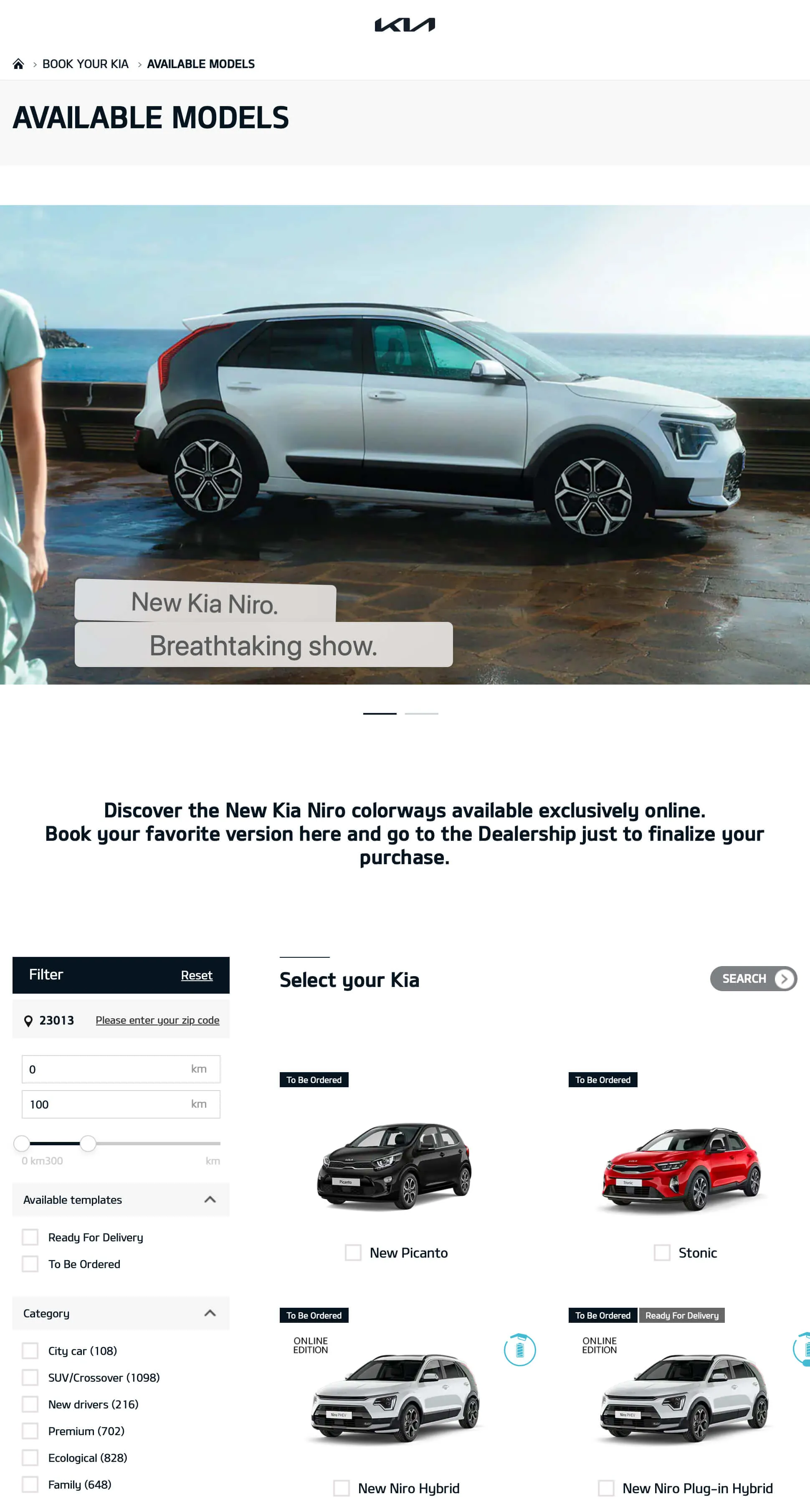
Competitive benchmark
Conducted a thorough analysis of the competitive landscape, studying how leading automotive brands approach their stock locator and vehicle discovery experiences.
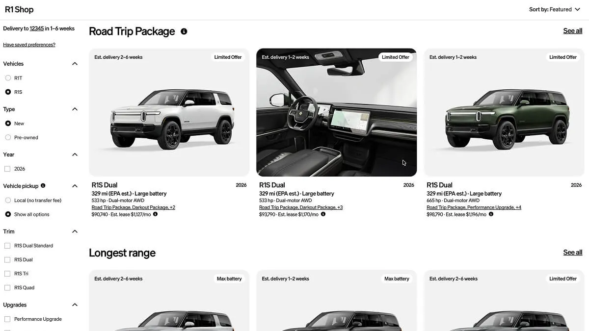
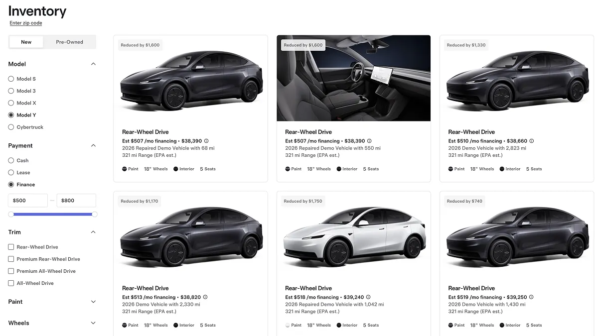
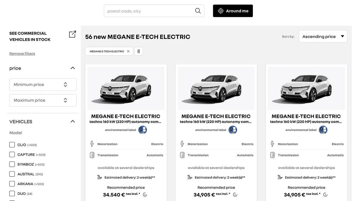
Brands analyzed: Porsche, Volkswagen, Tesla, Rivian and Renault.
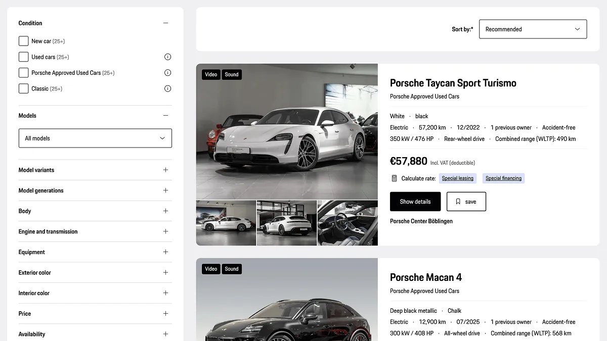
Porsche stock locator
Stakeholder workshops
I facilitated workshops with Kia's stakeholders to align on user needs, business priorities, and key pain points before moving into solution design.
These sessions helped surface insights from the frontline, dealership feedback, customer behaviour patterns, and market-specific constraints that shaped our design direction.
Current website
Before designing the new experience, the existing stock locator was audited to understand where users were struggling and why drop-off rates were high.
The audit revealed recurring patterns: an overwhelming number of filter options, dense information that was hard to scan, and a multi-step flow that required too much effort before users could see relevant results.
Home
A large marketing banner dominated the top of the page, pushing the search experience below the fold.
Model filters, body types, and categories were all presented at once, making it unclear where users should begin.
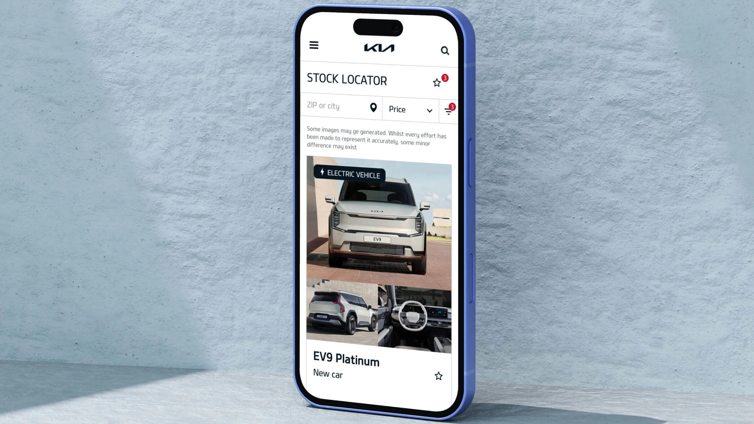
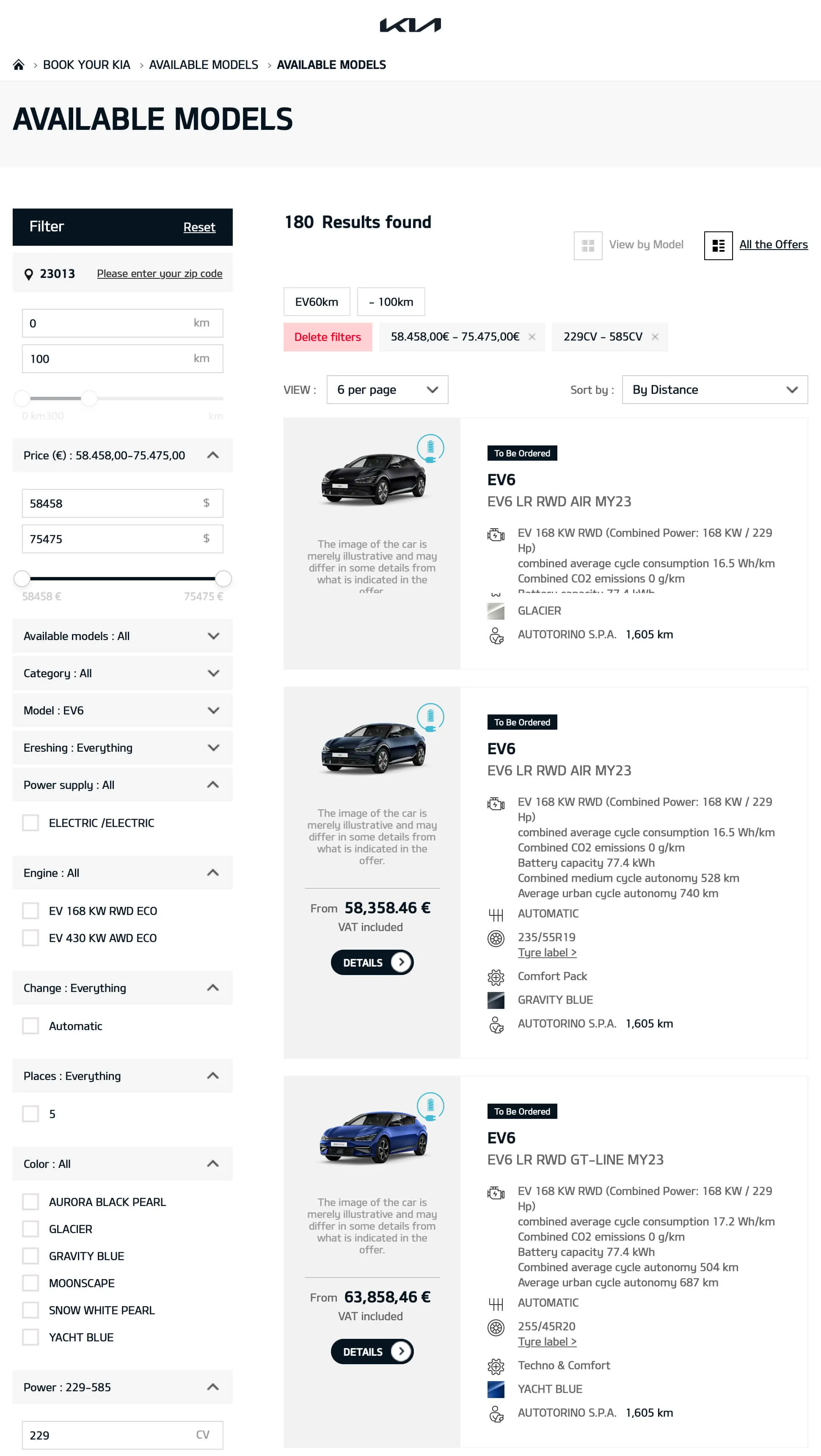
Results
The results page was dense and lacked visual hierarchy, making it hard to compare vehicles or quickly spot the most relevant details.
Car images were small and thumbnail-like, failing to give users a proper sense of the vehicle.
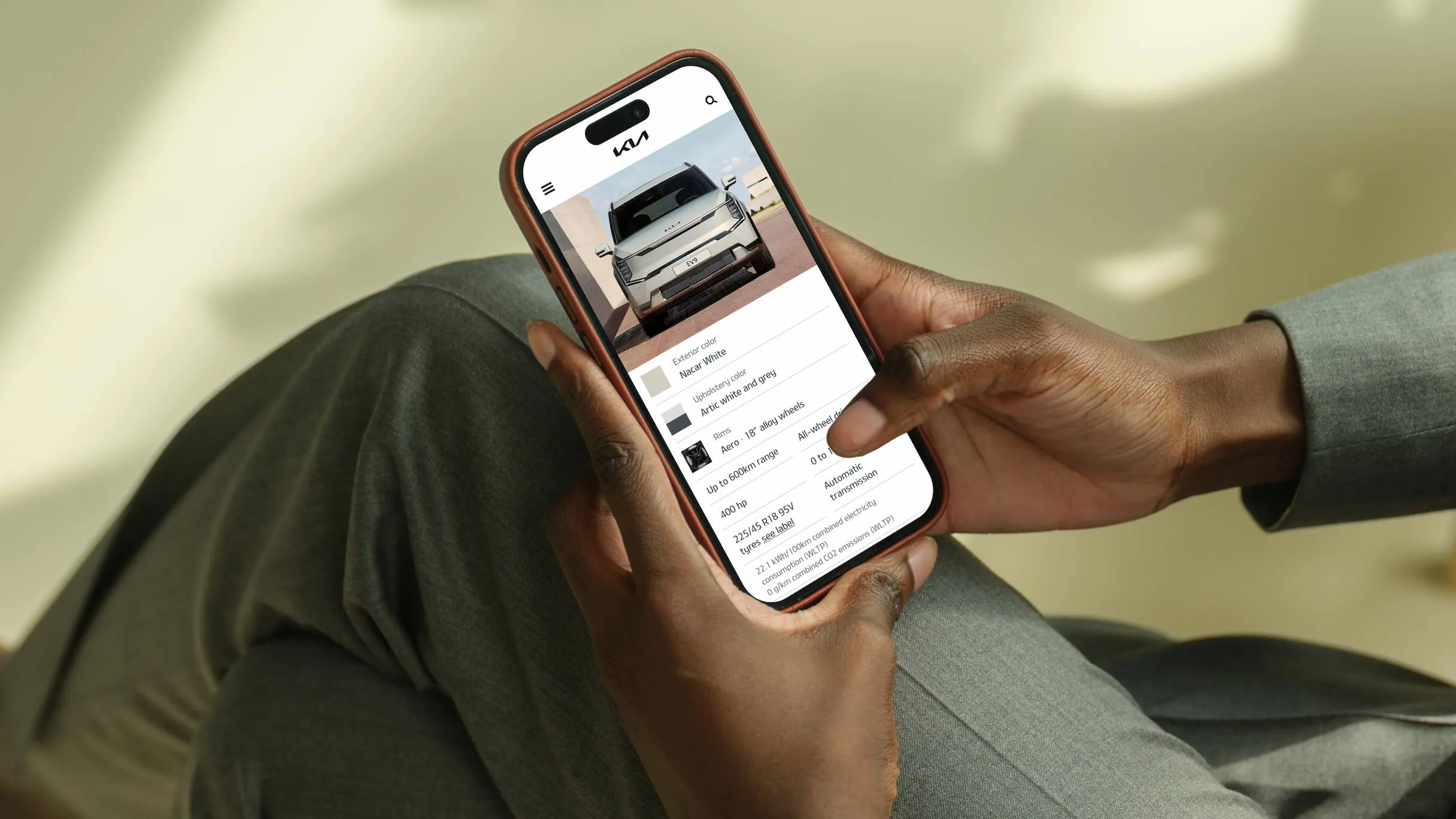
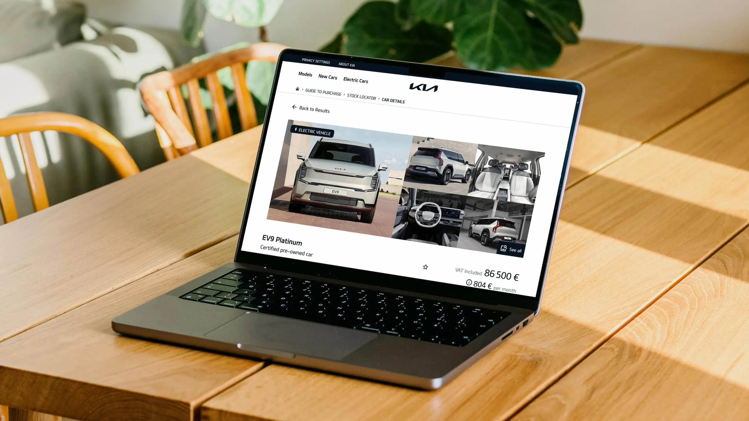
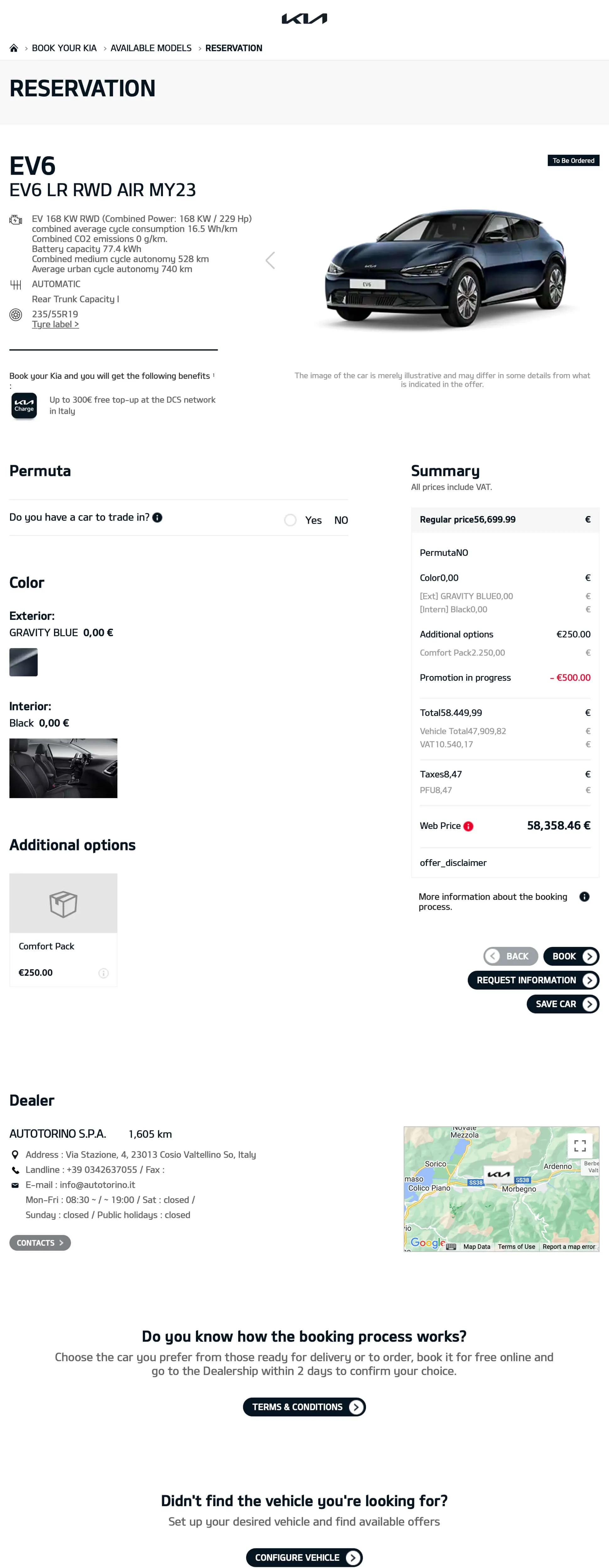
Vehicle details
Key specs and calls to action were buried under excessive content with no clear structure.
Users had to scroll through most of the page before reaching the actions they actually needed.
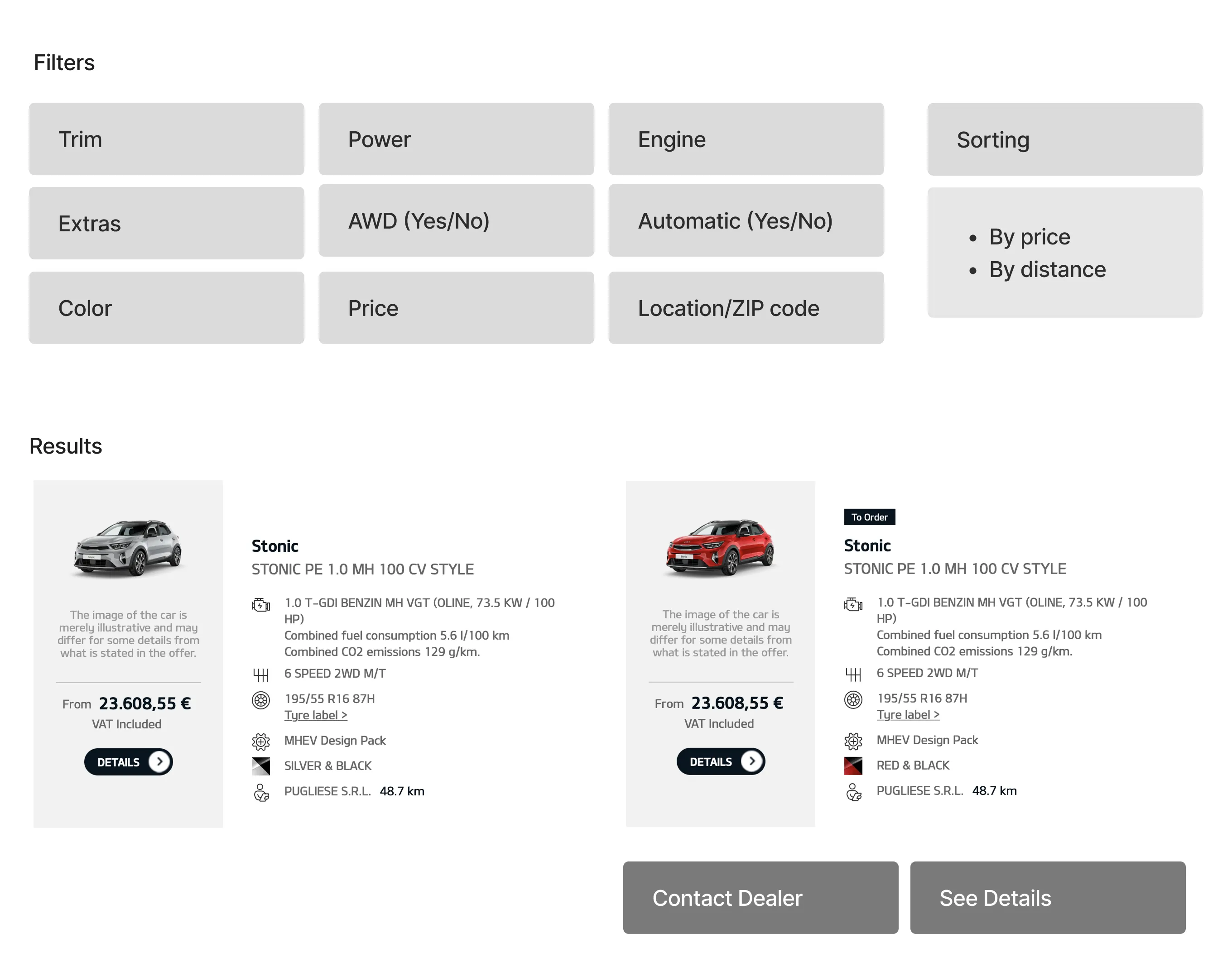
Wireframes
Using FigJam, we explored the information architecture and layout before moving into high-fidelity designs.
Components
We designed distinct card types to support new vehicles, pre-owned, and Kia Flex leasing offerings — each visually differentiated and scannable.
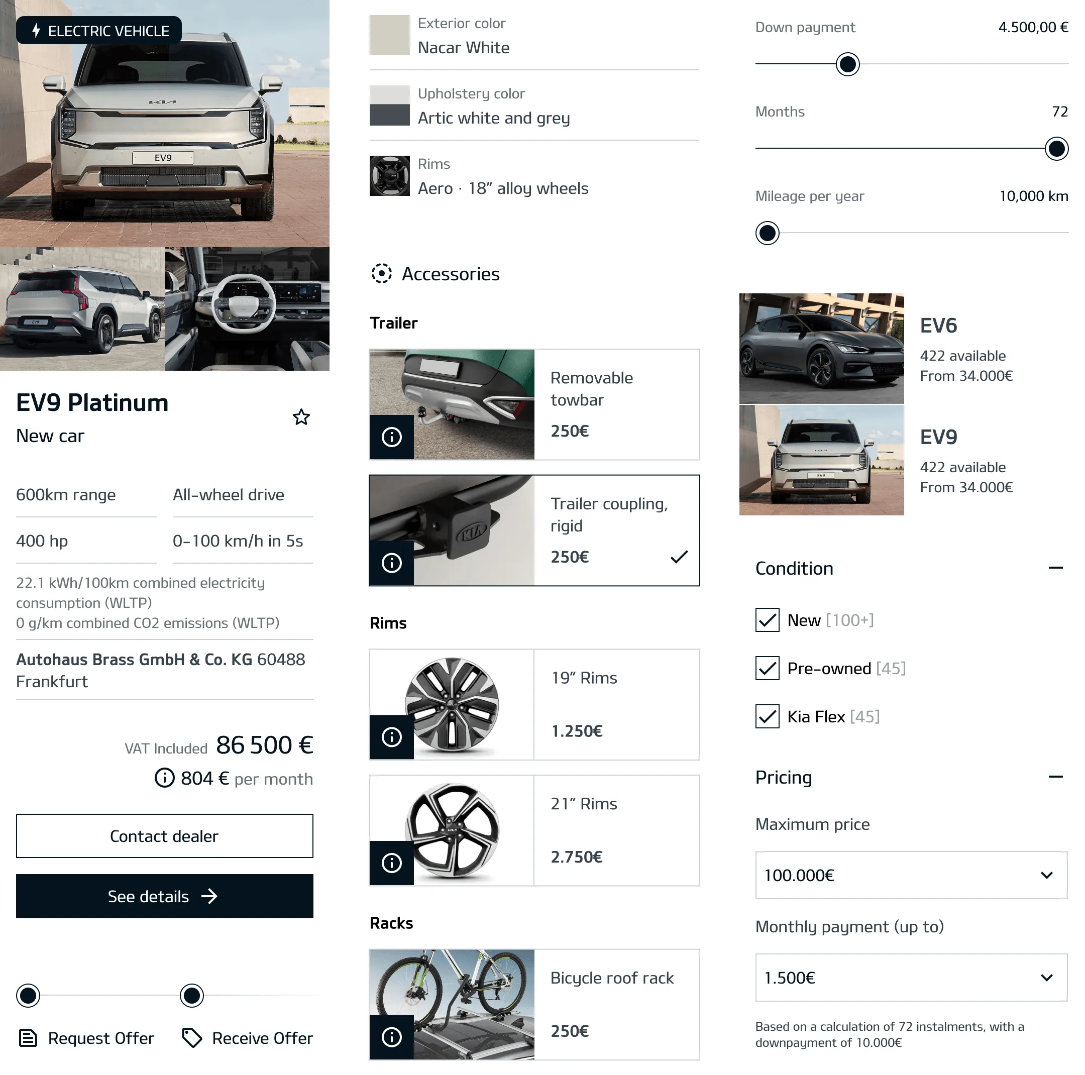
High fidelity designs
Desktop
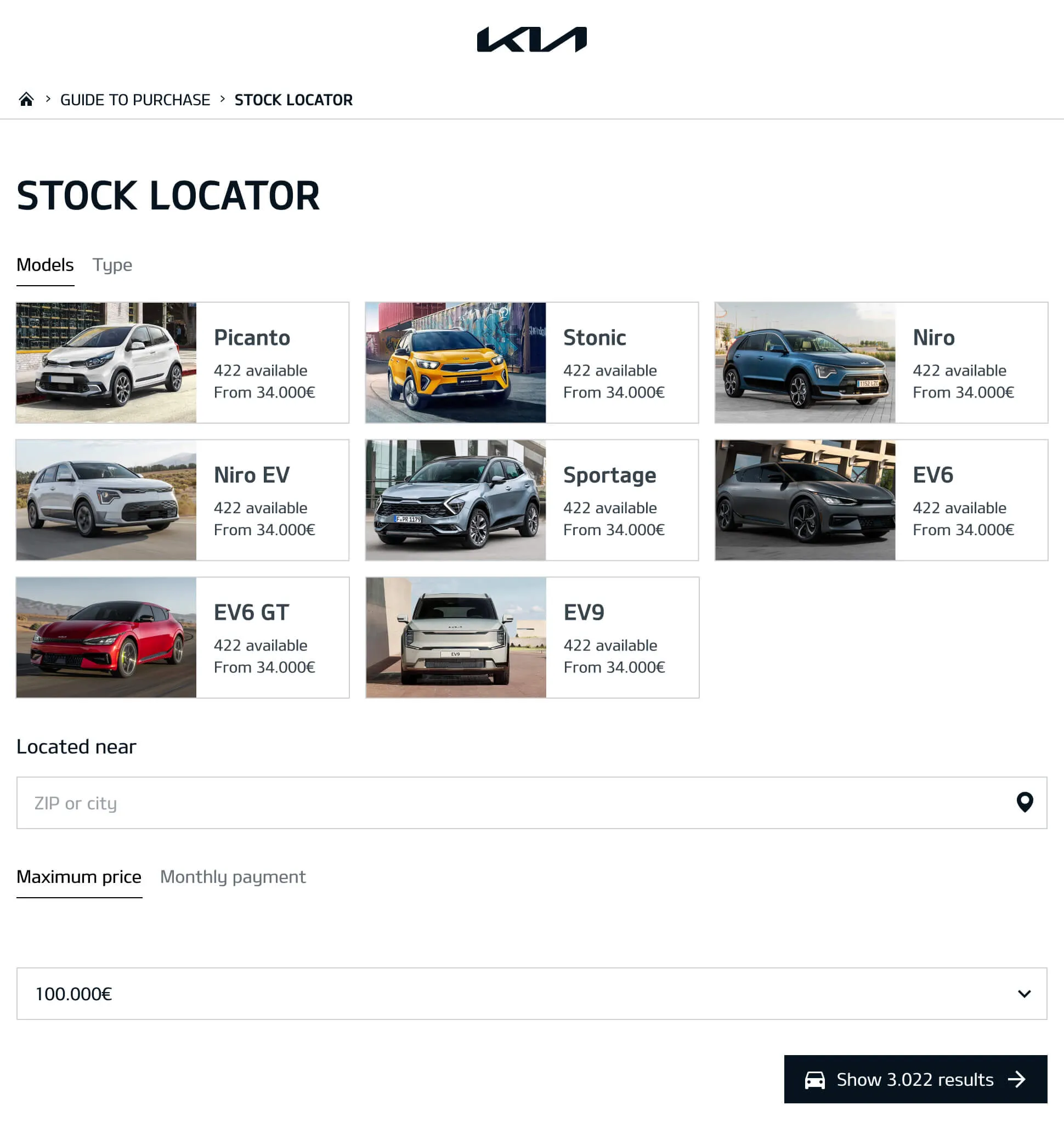
Home
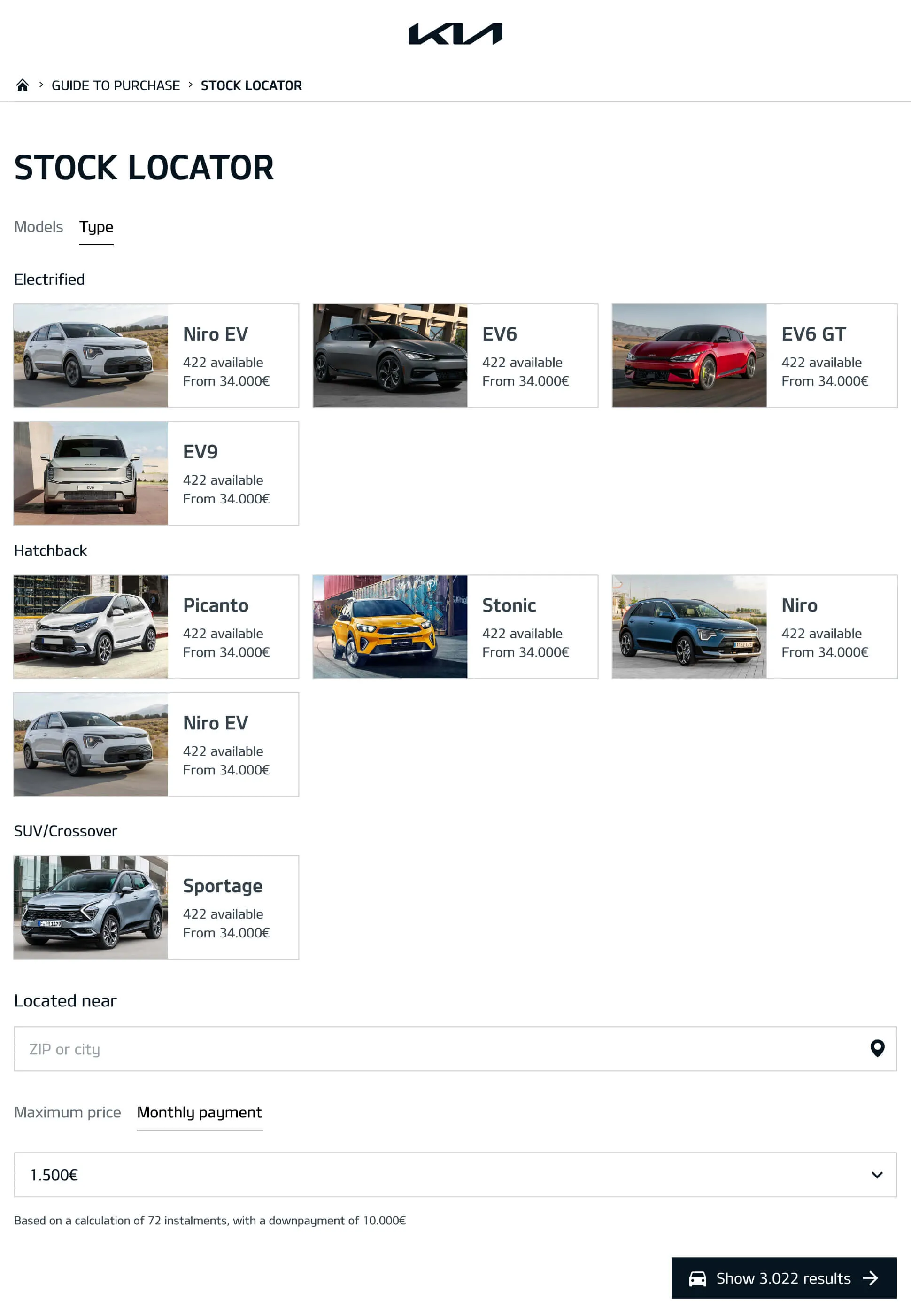
Home ⋅ Type
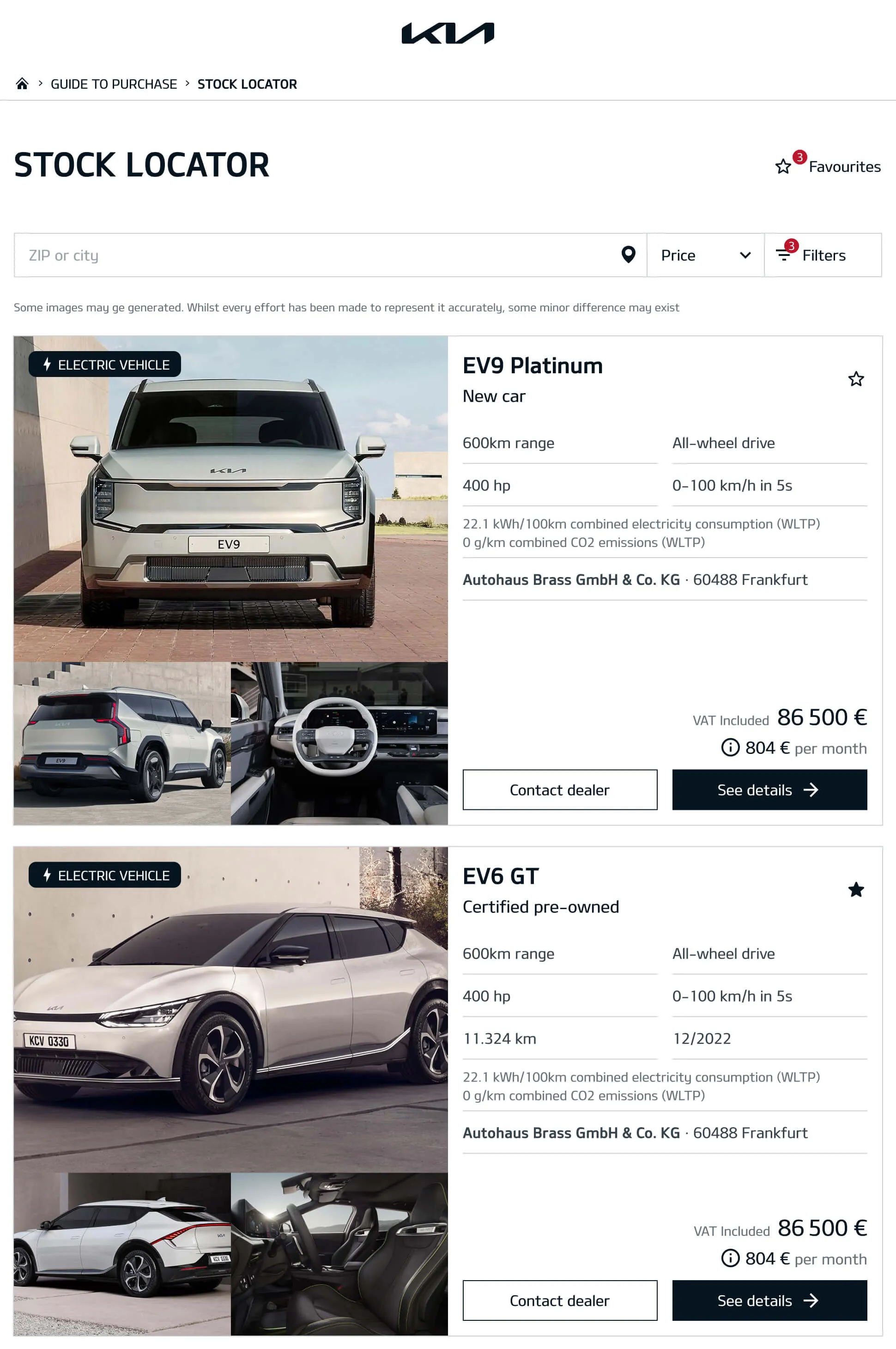
Results
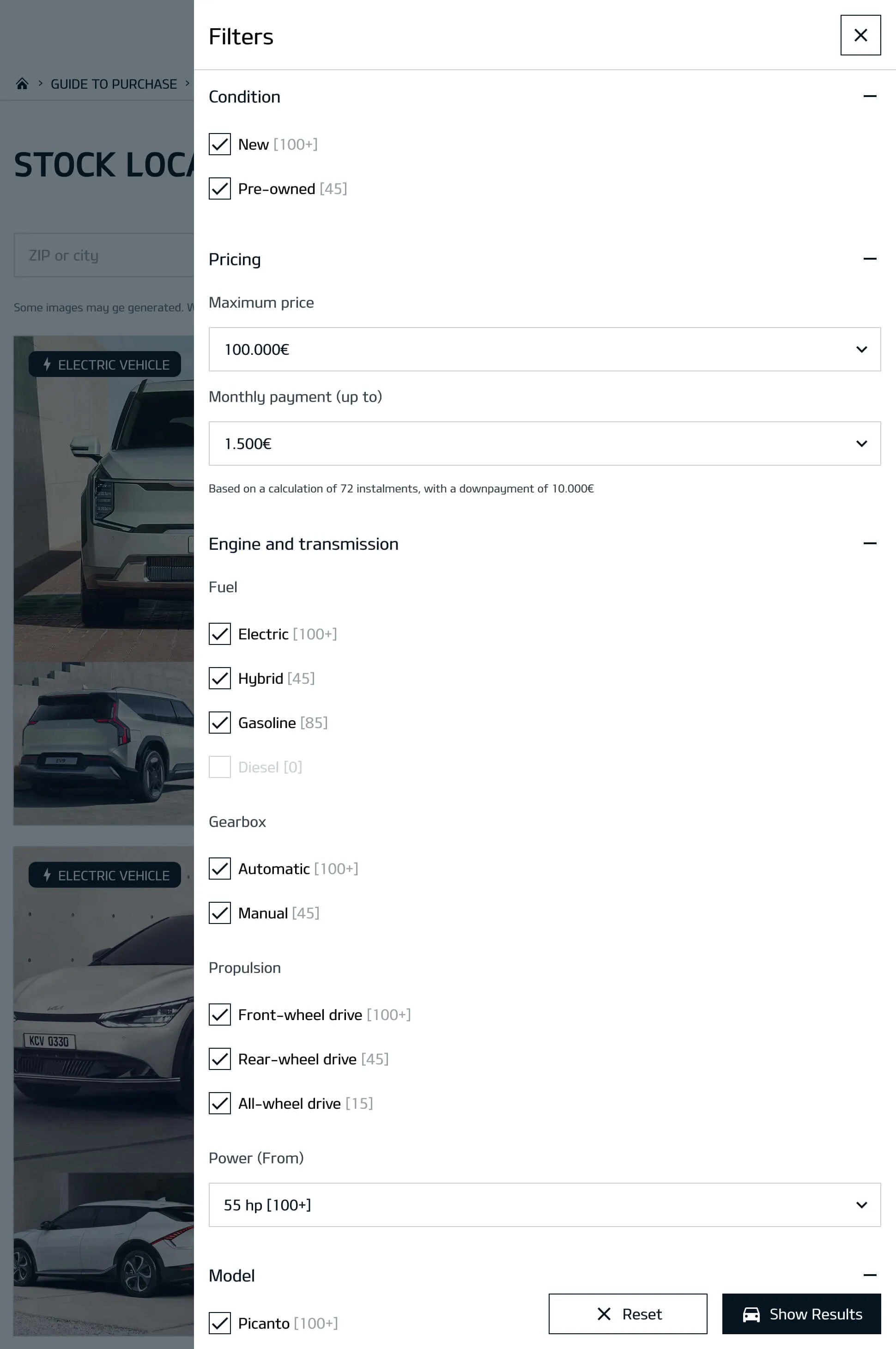
Filters
Vehicle details
Mobile
Home ⋅ models
Home ⋅ type
Results
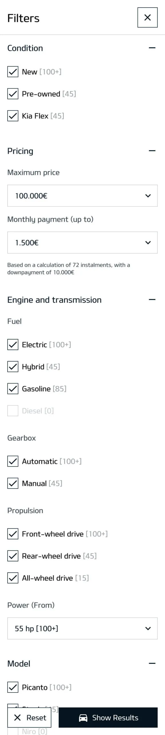
Filters
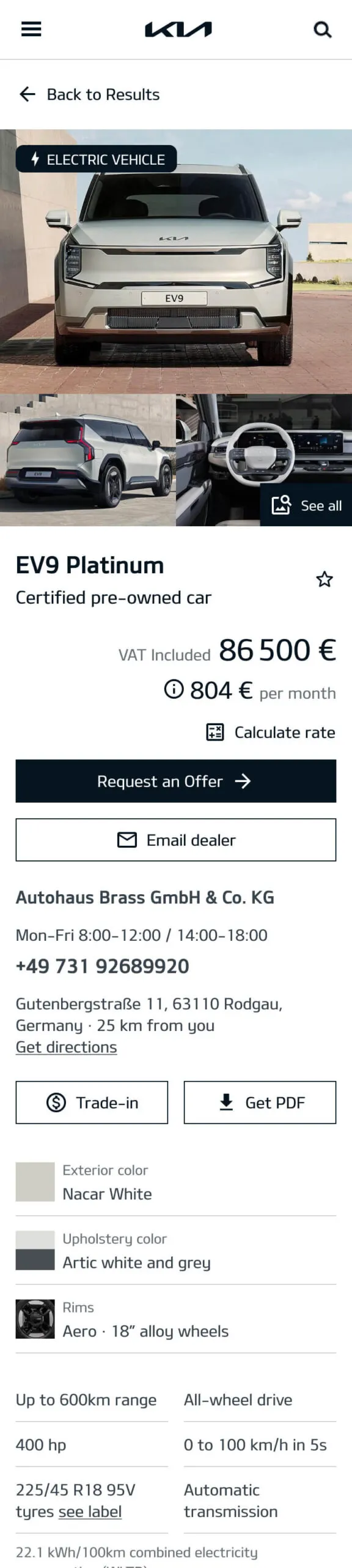
Vehicle details
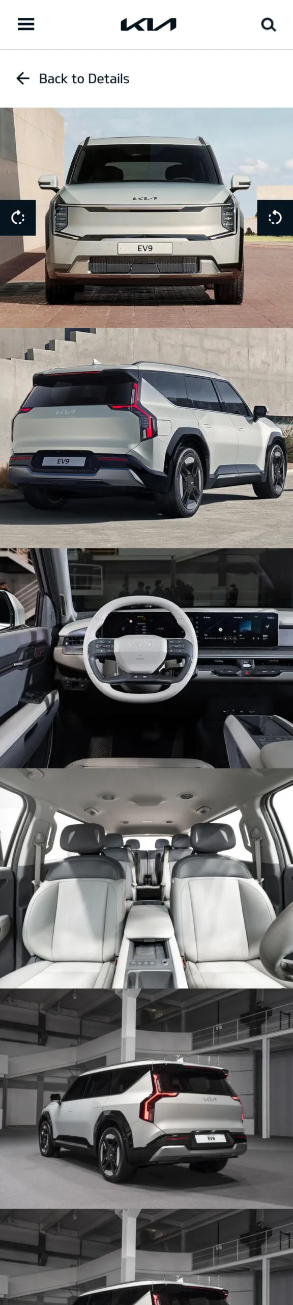
Vehicle images
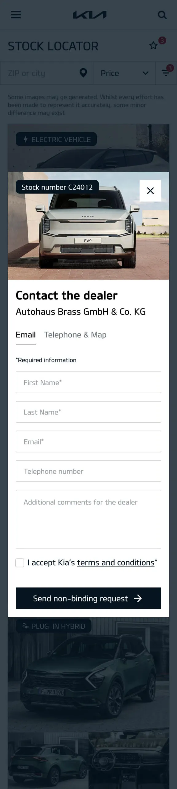
Dealer form
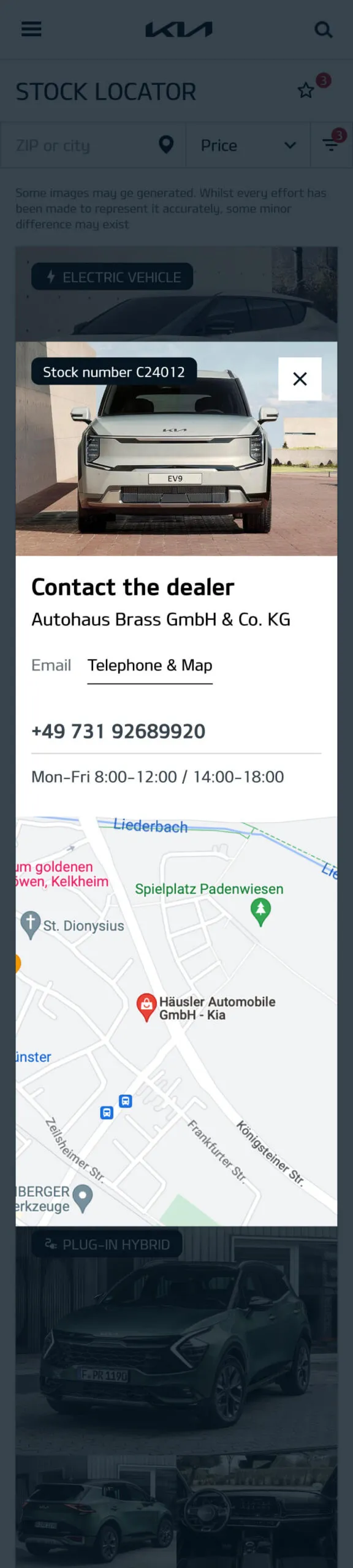
Dealer ⋅ phone & Map
Final Thoughts
I feel we accomplished a lot for such a small team and for a short period of time. The project pushed us to balance user needs, business goals, and technical constraints while keeping the design clean and intuitive.
Thanks for reading, want to collaborate together? Contact me here